Website Redesign
Homepage Before Redesign

Redesigned Homepage Desktop Viewport

Hub Page Desktop Viewport

Find A Representative Desktop Viewport

Error States Desktop Viewport

Product Page Desktop Viewport

Desktop Drop-down Navigation

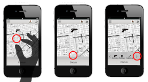
Mobile Drop-down Navigation Viewport


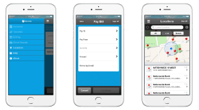
Home Page/Product Mobile Viewport


Sketches, User flows, and wireframes coming soon
Portfolio
Work Information:
Tools: Sketch, Adobe Photoshop
DESCRIPTION:
Park Avenue Securities needed a fresh website redesign to match their new branding initiative. Keeping in mind the three personas and how they used the site I designed a simple navigation and content hubs that would make users tasks easier. I also utilized the new color palette and tried to keep the page bright, cheerful, and modern. The original site was not responsive so I took a mobile first approach while designing.